
DoorVia
A bold access-focused brand identity built around a distinctive open-door mark and digital-first colour system.
CLIENT
DoorVia
INDUSTRY
Property Technology
SERVICES
Brand Strategy, Brand Identity, Digital Direction, Launch Creative
YEAR
2026
Scope
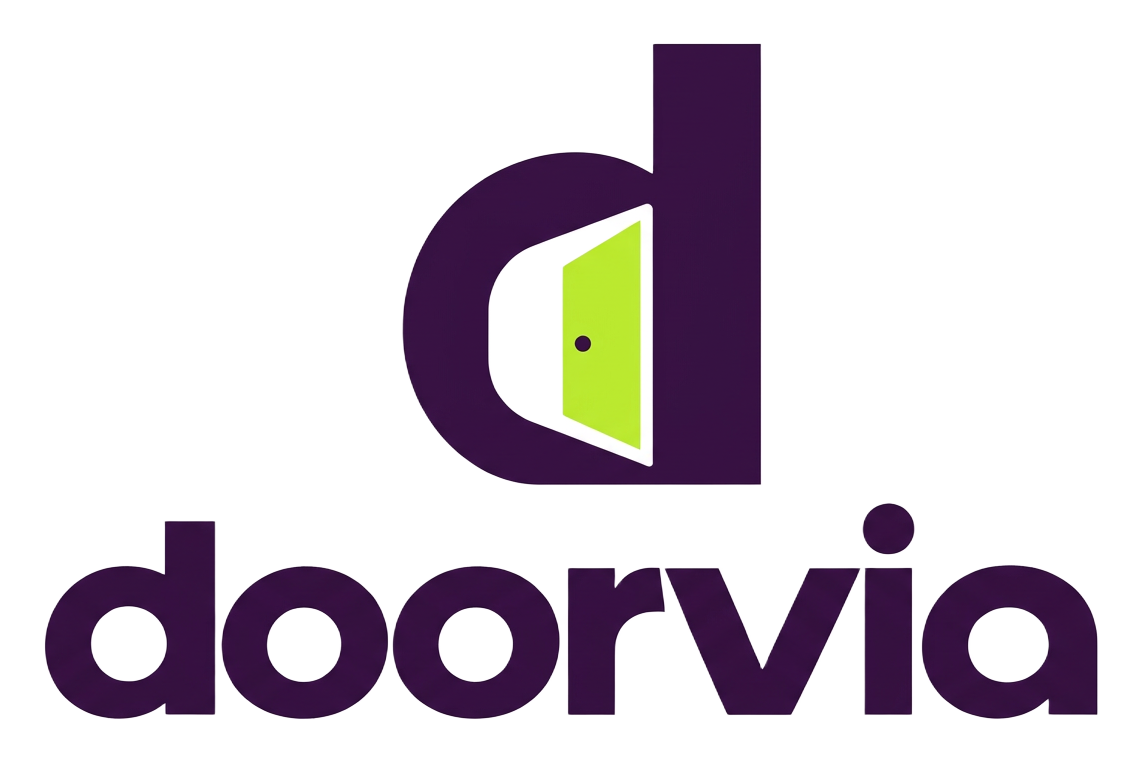
Brand strategy, identity and digital direction for DoorVia, developed around a distinctive open-door symbol and a confident high-contrast colour system.
ENGAGEMENT
Brand development
DISCIPLINES
Strategy + design
DELIVERY
Identity + applications
STATUS
Live
Services delivered
Strategy
- Brand strategy
- Positioning
- Voice direction
Identity
- Door symbol and wordmark
- Purple and lime colour system
- Digital graphic language
Applications
- Digital direction
- Launch creative
- Brand templates
Deliverables
- 01Door symbol and wordmark
- 02Purple and lime colour system
- 03Digital graphic language
- 04Digital direction
- 05Launch creative
- 06Brand templates
The Challenge
The brand needed an immediately recognizable signal that could stay clear at app-icon scale and expand into a full launch identity.
DoorVia brand system
The Approach
We made the doorway the central brand device, pairing a vivid lime opening with a deep purple field for strong recognition across digital touchpoints.
The Result
DoorVia is live with a focused, scalable identity system and launch-ready creative direction for continued product development.
Brand strategy + Positioning + Voice direction
STRATEGY
Door symbol and wordmark + Purple and lime colour system + Digital graphic language
IDENTITY
Digital direction + Launch creative + Brand templates
APPLICATIONS
Live
STATUS
Let's make somethingworth remembering.